Friday 15 April 2011

Production Process


i used photoshop to edit all of the photographs used in my media text, the tools i used the most were, the polygon lasoo tool, to take away the background of some of the photographs, the auto colour, auto brightness and auto contrast, to make the photographs look like they belong in the desired genre of rock/punk. i also used photoshop to make all of my falshes, puffs and other additional things that were added to my cover, contents page and double page spread. I also used photoshop to make my masthead for the cover of my magazine, i had a number of attempts at different mastheads,and i finally decided on the one i used because i liked the effect it had with the rest of the cover and the photographs. i found the use of photoshop easy to get used to all the tools,options,layers etc.
an example of something from my contents page that i created in photoshop:

I created this by using a plain sans serif font and then removing the background so that the writing was the only thing on the layer, i then used the rubber on a high oppasitiy to make it look aged, or like it had been stamped onto the page, this effect is used alot in 'Kerrang!' magazine, so i used it my work as a referance back to the studied magazine. I used this effect numerous times in my work so that the rock/punk theme went through my whole media text.

I used InDesign to put all my work together, again using layers, but this time i used different frames for different things such as, background, central image, masthead, featured articles, puffs and banners. I found InDesign easy enough to use, the frames and layers made it really easy to handle and keep track of where things are/ should be on the document.


Production Process for Cover:


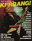
I started by looking at a number of kerrang magazines, i looked at all the techniques used to make the cover more appealing to an audience and made a note of them so i could use them in my work,
Also while i was working i'd have these example open on the screen so i could make comparisons to be sure my cover looked professional and eye catching.

The first part of my cover that i did was the background:

This was my original colour scheme idea for the background, i created it using frames to make the background and used the fill tool to give them the colours.


i chose not to use this masthead becuase i thought it looked really plain and not very eye catching and professional. I also don't think it fits very well with the rock genre as it is very bright and happy looking.


I then decided to add something to it to see if i could improve it, i came to the conclusion that it was too bold and has no effect to it to make it eye catching and i think it looks really unprofessional and still doesn't fit with the rock genre, I could see this because it doesn't look like the masthead on any of my studied magazine covers. 


My final masthead, In my opinion the plain San Serif text looks really effective now that i've added a drop shaddow and made it look three dimentional, this will make it more eye catching and more likely to sell. It looks professional and neat, unlike my first two mastheads that look dull and unprofessional and don't match the Gothic genre magazines that I'd looked at for inspiration..

Once i'd Chosen my masthead i went back to the background that i'd designed and added it to it, i also added the frames i'd need for photographs and other copy


I also added the barcode and price because it was the smallest part on the page and i didnt want to forget about it because its one of the key parts on the cover. I used InDesign to put all of the frames in the positions I wanted them for my photographs and other copy for the cover.

I then started editing the images to put on the cover, I used photoshop to edit all of my photographs

Final Cover-

Once I'd Photo shopped and added my photographs onto the cover, I compared my work so far to the other 'Kerang!' magazines I was using for inspiration and didn't think the colour scheme fit the genre very well, therefore I came to the decision of changing it to black red and white, with little bits of blue to compliment the other colours by contrasting with them. The connotations of these colours fit well with my chosen genre, red connotes and danger or stop, black connotes as dark, death, spooky and Gothic, clearly fitting with the rock genre. The white however contrast with all of the other colours as it connotes as black or empty.

Final Cover-

I'm really happy with how my cover turned out, In my opinion it looks really professional and neat, I think that if it were a really published magazine that it would have a good selling rate. 


Like the magazine covers that I studied I decided to analyse my own cover, showing all of the techniques i used, taken from my inspired covers.

Contents page production process-


I looked at a number of contents pages from other magazines and looked at the different layouts, colour schemes and techniques used on them.
I noticed that the contents pages aren't very busy, showing that its more informative than made to attract the audience's attention


 I then looked at 'Kerrang!' magazine contents pages as this was the main magazine I got my inspiration from,
I've notice that unlike the other contents pages I'd looked at, the Kerrang! ones are very busy and upbeat, this is a representation of the rock/punk social group, showing the energetic, upbeat nature of them.

I made my contents page using InDesign, in the same way I made my cover, I used Photoshop to edit all of my photographs and then used InDesign to add the pictures to the background, again using frames to keep my work organised.

My final contents page turned out to look a lot like the ones I studied which I'm very pleased with.
I carried on the colour palette used on my Cover, I used several techniques used on the contents pages that I'd studied, for example, I used the split page and had a photograph across the whole top half of the page, along with the 'Contents' title and a featured article, I also used the technique of having a box with the name of my magazine and 'THIS WEEK' which was used on the Kerrang contents pages that I studied. I used polariod style photographs to create the effect that things had been stuck onto the page, much like the peeling sticker I used on my cover.

Double Page Spread Production Process-


I looked at a number of double page spreads from different magazines to see what the different magazines did, i notice that there is usually a lot of photographs and the title usually takes up the whole top part of one page with the text below it and then images on the other page, this makes it look really appealing because it looks like there's not a lot of text and it can be read easily, i also noticed that the first letter of the text it much bigger and in a different colour than the rest of the text on the page.

I'm really happy with how my double page spread turned out, I used several techniques used in the double page spread that I looked at, which means I used techniques used in non rock/punk magazines, I did this to give it a girly feel because the person in the interview seems very girly, therefore making it easy to tell just by looking at the cover. I also carried on using the technique of making things look like they're stuck on the page, i did this with two polariod photographs at the top of the page and a post-it note at the bottom of the page with i little bit of extra information that wasn't mentioned in the interview.
The interview was inspired by an interview of Taylor Momsen in 'Sugar' magazine which is a very girly magazine, i chose to do a girly interview to countertype with what people assume  the rock/punk social group to be, therefore showing it through my work that there's more to them than you think.

Thursday 17 February 2011

Design Process

Mood boards-

I made a couple of inspirational mood boards to make it easier to compare my magazine/ photographs to ones taken specifically for the rock/punk genre,


I looked at photographs of band/band members of the rock genre for ideas for the photographs in my cover/contents page/double page spread.
i noticed that a lot of the photographs are in direct address to the audience, this being a technique to use in my work.
Also they're all very expressive and full of energy and bounce, I will use this in my own photographs.
This also shows that the rock/punk social group is represented as very confident and outgoing.
The photographs are also very bright and colourful, also counter-typing the stereotypical views on the rock/punk social group, people usually think that people that are rock/punk are very rebellious, loud and disruptive, but if you read through a rock/punk magazine you'd see that they're not.


I then looked as some different rock/punk magazines and inspirational ideas for my magazine. I looked at two different magazines, 'Kerrang!' and 'Rocksound'.
I then decided I'd look further at the Kerrang! magazine because i like the look of it and i can buy it easy at is is released weekly and will be good to compare with my own work. I made a mood board of several Kerrang! magazines to see the variations of the central image, masthead, featured articles and puffs and flashes. 
I then drew up a couple  mock ups of what I's like my cover to look like using the inspired covers and photographs of bands/band members. 
i used the different techniques used on the covers that I'd studied, such as, peeling stickers as puffs, featured articles going down the side and along the bottom of the cover, the price being in a corner really small, using a direct address photograph for the central image. 
I didn't add and featured articles to the mock up because I wanted to make it simple enough to build up gradually.

The industry


History of magazines-


Magazines didn't look like what they do now until after World War II,  The first magazines in the 1700s, looked like....books. They were produced on magazine printing presses rather than printers which are used nowadays. 


The Gentleman's Magazine was first published in 1731, is considered to have been the first general-interest magazine. Edward Cave, who edited The Gentleman's Magazine was the first to use the term "magazine"
The oldest consumer magazine that is still in print now is The Scots Magazine, which was first published in 1739, although it had  multiple changes in ownership and gaps in publication totaling over 90 years weaken the claim that it's been the longest running magazine that's still around.


History of music magazines-


The New Musical Express (better known as the NME) is a popular music magazine in the United Kingdom, published weekly since March 1952. It was the first British paper to include a singles chart, in the 14 November 1952 edition. In the 1970s it became the best-selling British music magazine. During the period 1972 to 1976 it was particularly associated with gonzo journalism, then became closely associated with punk rock through the writing of Tony Parsons and Julie Burchill.(taken from wikipedia)


History of Kerrang! magazine-

Kerrang! magazine cover october 1981

kerrang! 6 August 2008 cover


The image on the right is of  issue 4 with German heavy metal guitarist Michael Schenker on the cover. Below is the 6 August 2008 cover this shows how much the magazine has changed since it was first released in 1952. 


Spotlight Publications released Kerrang Weekly.
In  June 1981- Kerrang! started out as a relation to Sounds magazine before being launched as it's own title of Kerrang! title. 
In 1991, it was sold to Emap (which was taken over by Bauer in 2008)


Emap launched Kerrang! as a national digital radio station in 2000 and there is also a TV channel.Kerrang! now claims to be the world's biggest-selling rock weekly, having competed with NME for the top-selling UK position since 2002. There are also Australian and Spanish versions of Kerrang!


Parts of a magazine cover-
the different parts of the cover serve a particular purpose;

masthead
the masthead is basically the name of the magazine and is mostly the biggest feature on the cover of the magazine.

Central Image
the central image is used to draw the audiences attention to the magazine, it does this by being in indirect or direct address, indirect address is where the person/people in the photograph are looking away from the audience, whether its the whole body or just the eyes. A direct address photograph is where the person is looking directly out to the audience, as I've found from my research into different magazines, the most common used address is direct because its more eye catching. 

puffs-
 puffs are little pictures or boxed words on the page giving the audience a better idea of what they'll find in the magazine.
Featured articles-
Featured articles are often along a certain strip on the page, they are used to give the reader an idea of what's inside the magazine without having to open it. they are often supported with photographs which also makes the magazine more attention grabbing. 

Price and magazine information-
this information is usually in a corner very small so that it's not one of the first thing the audience see's, this is done because the price is obviously quite high otherwise it would be used as an attention grabbing technique like on the covers of TV magazines, which are often very low price. 

Producers and distribution-

Kerrang magazine is produced and distributed by a number of people working together...
  • Nichola Browne (editor)
  • Daniel J. Lane (deputy editor, podcasts)
  • Caroline Fish (art editor)
  • Lucy Williams (production editor)
  • Simon Young (news and introducings editor, podcasts)
  • Nick Ruskell (reviews editor)
  • Scarlet Borg (picture editor)
  • Alex Shellim (junior designer)
  • Bobbie Lane (sub editor/editorial assistant)
  • Phil Alexander (editor in chief)
  • Rimi Atwal (publishing director)--Wikipedia.