History of magazines-
Magazines didn't look like what they do now until after World War II, The first magazines in the 1700s, looked like....books. They were produced on magazine printing presses rather than printers which are used nowadays.
The Gentleman's Magazine was first published in 1731, is considered to have been the first general-interest magazine. Edward Cave, who edited The Gentleman's Magazine was the first to use the term "magazine"
The oldest consumer magazine that is still in print now is The Scots Magazine, which was first published in 1739, although it had multiple changes in ownership and gaps in publication totaling over 90 years weaken the claim that it's been the longest running magazine that's still around.
History of music magazines-
The New Musical Express (better known as the NME) is a popular music magazine in the United Kingdom, published weekly since March 1952. It was the first British paper to include a singles chart, in the 14 November 1952 edition. In the 1970s it became the best-selling British music magazine. During the period 1972 to 1976 it was particularly associated with gonzo journalism, then became closely associated with punk rock through the writing of Tony Parsons and Julie Burchill.(taken from wikipedia)
History of Kerrang! magazine-
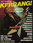
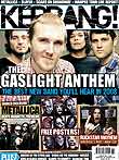
The image on the right is of issue 4 with German heavy metal guitarist Michael Schenker on the cover. Below is the 6 August 2008 cover this shows how much the magazine has changed since it was first released in 1952.
Spotlight Publications released Kerrang Weekly.
In June 1981- Kerrang! started out as a relation to Sounds magazine before being launched as it's own title of Kerrang! title.
In 1991, it was sold to Emap (which was taken over by Bauer in 2008)

Emap launched Kerrang! as a national digital radio station in 2000 and there is also a TV channel.Kerrang! now claims to be the world's biggest-selling rock weekly, having competed with NME for the top-selling UK position since 2002. There are also Australian and Spanish versions of Kerrang!
Parts of a magazine cover-
the different parts of the cover serve a particular purpose;
masthead-
the masthead is basically the name of the magazine and is mostly the biggest feature on the cover of the magazine.
Central Image-
the central image is used to draw the audiences attention to the magazine, it does this by being in indirect or direct address, indirect address is where the person/people in the photograph are looking away from the audience, whether its the whole body or just the eyes. A direct address photograph is where the person is looking directly out to the audience, as I've found from my research into different magazines, the most common used address is direct because its more eye catching.
puffs-
puffs are little pictures or boxed words on the page giving the audience a better idea of what they'll find in the magazine.
Featured articles-
Featured articles are often along a certain strip on the page, they are used to give the reader an idea of what's inside the magazine without having to open it. they are often supported with photographs which also makes the magazine more attention grabbing.
Price and magazine information-
this information is usually in a corner very small so that it's not one of the first thing the audience see's, this is done because the price is obviously quite high otherwise it would be used as an attention grabbing technique like on the covers of TV magazines, which are often very low price.
Producers and distribution-
Kerrang magazine is produced and distributed by a number of people working together...
- Nichola Browne (editor)
- Daniel J. Lane (deputy editor, podcasts)
- Caroline Fish (art editor)
- Lucy Williams (production editor)
- Simon Young (news and introducings editor, podcasts)
- Nick Ruskell (reviews editor)
- Scarlet Borg (picture editor)
- Alex Shellim (junior designer)
- Bobbie Lane (sub editor/editorial assistant)
- Phil Alexander (editor in chief)
- Rimi Atwal (publishing director)--Wikipedia.


